CREATIVE DIRECTION
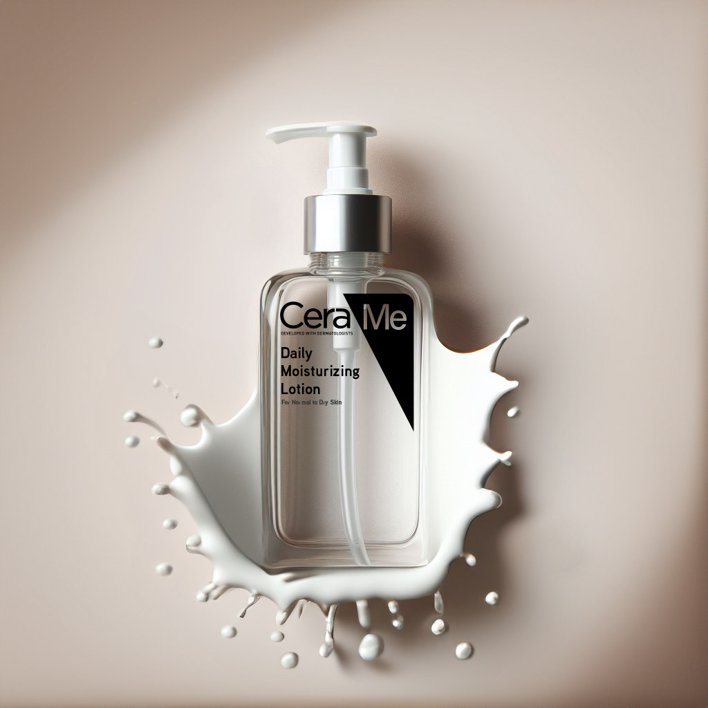
The name “CeraMe” shifts the focus from dermatology to identity. It celebrates individuality and routine, turning skincare into a form of self-expression. The creative direction softens CeraVe’s traditional look through minimal materials, tactile finishes and warm neutrals that invite a more human connection.
DESIGN APPROACH
• Refillable bottles crafted from glass or recycled plastic for sustainable reuse
• Simplified black and white typography and clean geometry for a more elevated visual tone
• Pump-based refill system to encourage long-term brand loyalty and reduced waste
• Concept for subscription-based refills designed to blend convenience and consciousness
MARKETING AND ACTIVATION VISION
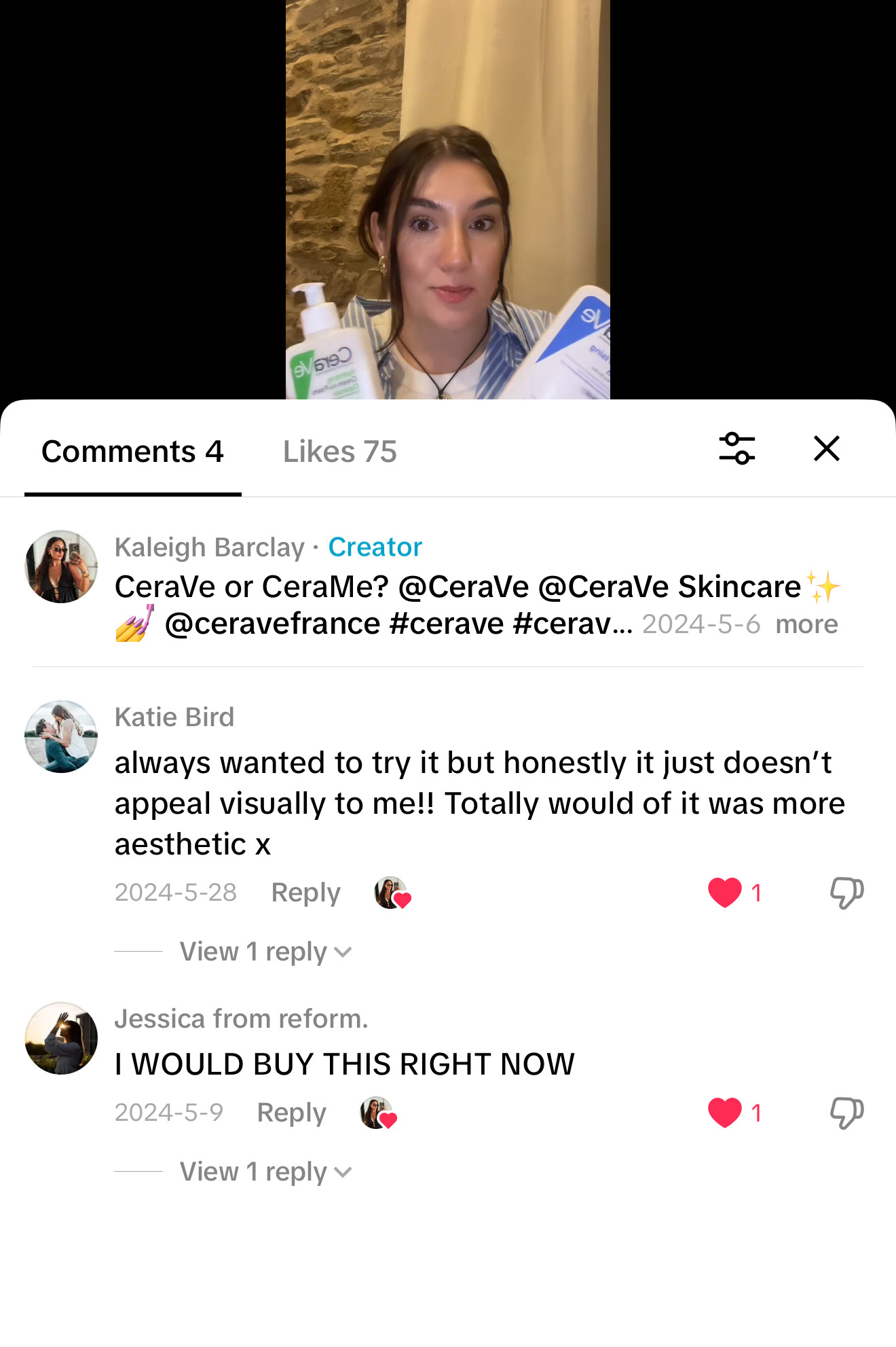
The project began with a TikTok concept where I spoke about my idea for CeraVe and how it could evolve into “CeraMe.” To expand this into a full campaign, I developed ideas for how the brand could communicate the concept across platforms.
The project began with a TikTok concept where I spoke about my idea for CeraVe and how it could evolve into “CeraMe.” To expand this into a full campaign, I developed ideas for how the brand could communicate the concept across platforms.
IF LAUNCHED AS A REAL CAMPAIGN
DIGITAL: A “CeraMe” short-form content series featuring creators showing their personal skincare rituals and refill setups.
RETAIL: Pop-up refill stations in flagship stores and curated beauty spaces, designed with mirrored refill walls and sensory zones.
PRINT AND PR: Editorial collaborations highlighting the shift from clinical care to conscious ritual.
COMMUNITY: A CeraMe refill reward program to encourage sustainability and repeat engagement.
PURPOSE
“CeraMe” demonstrates how a brand concept can extend beyond visuals into full campaign storytelling. It merges design, marketing and creative direction to show how sustainability and self-expression can shape the future of skincare.
“CeraMe” demonstrates how a brand concept can extend beyond visuals into full campaign storytelling. It merges design, marketing and creative direction to show how sustainability and self-expression can shape the future of skincare.