Phase Two: Evolving Identity (2025)
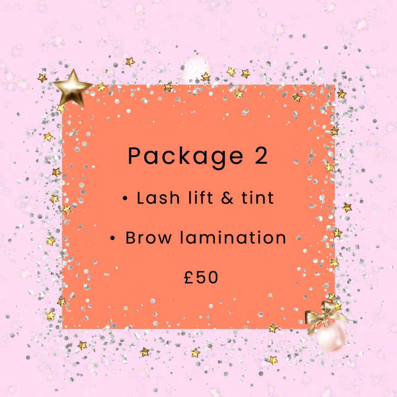
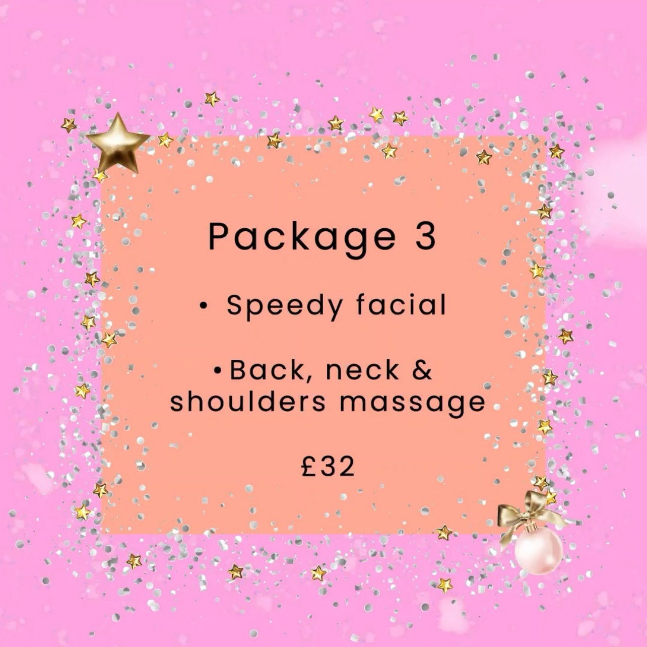
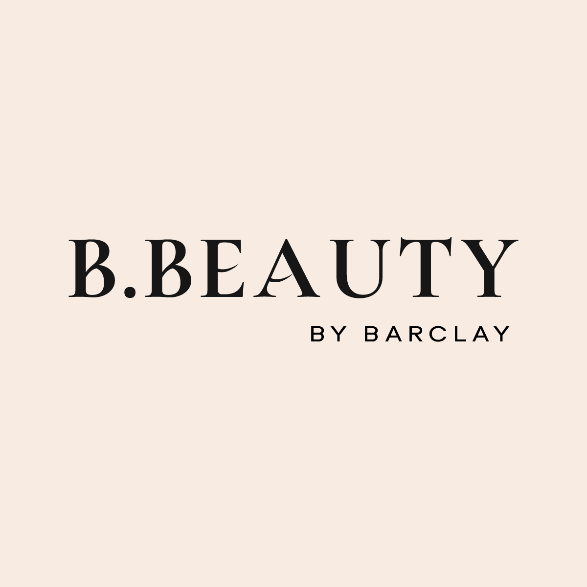
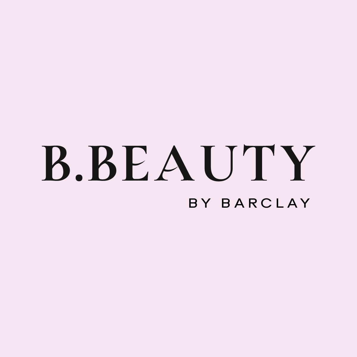
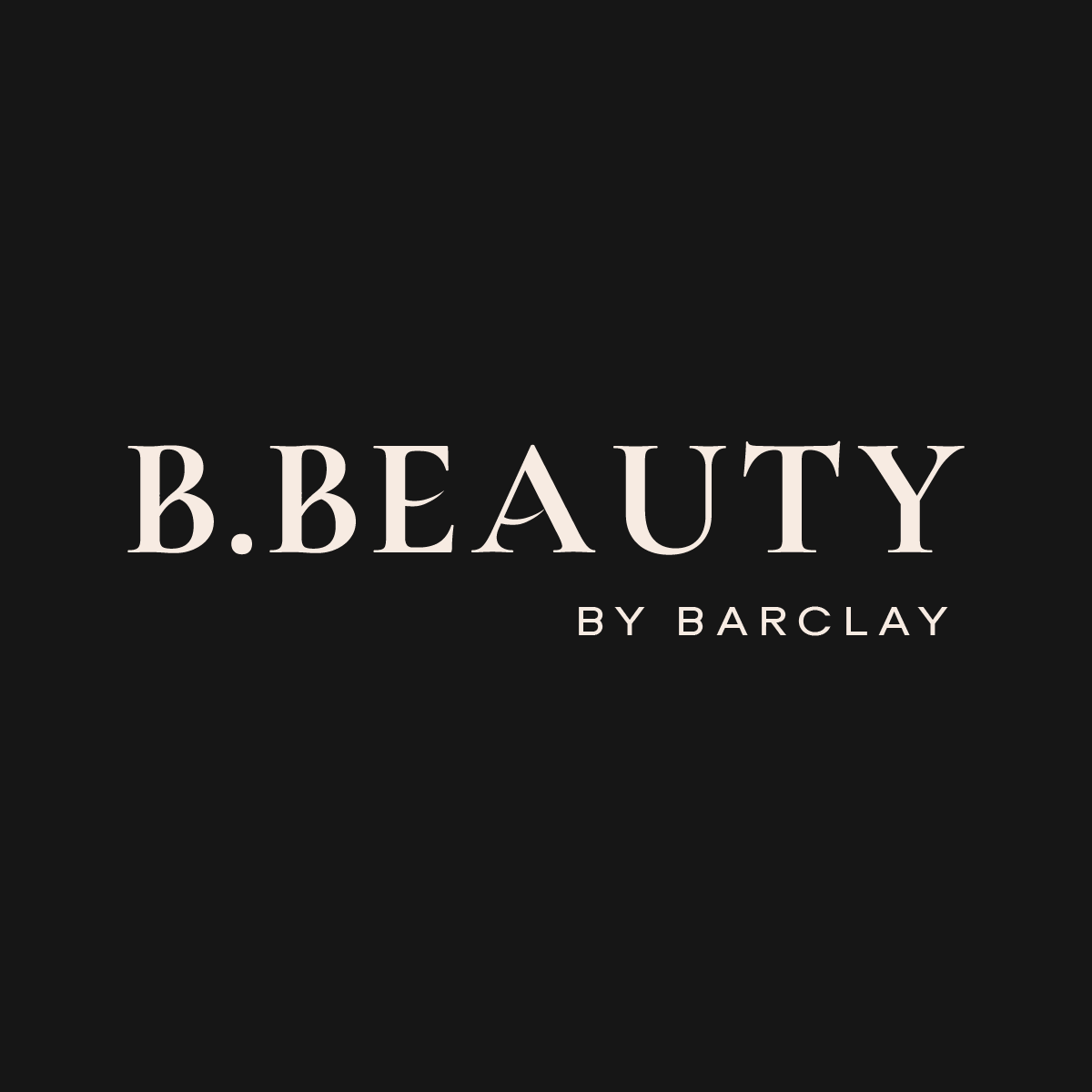
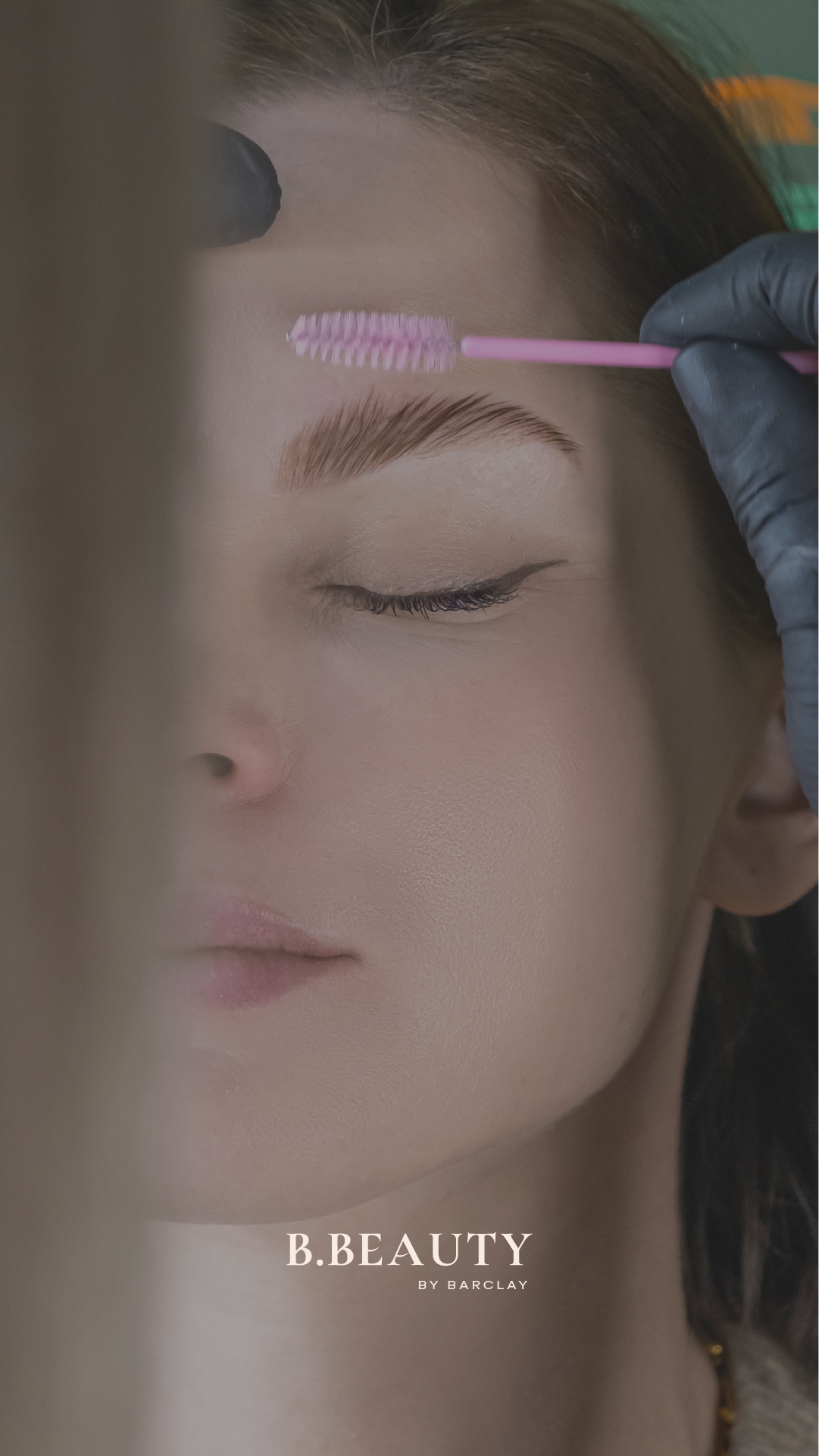
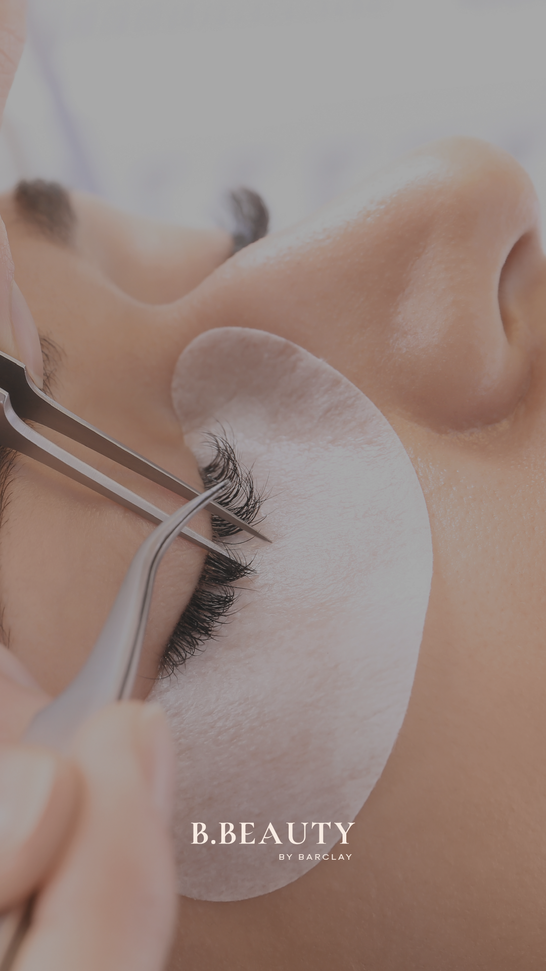
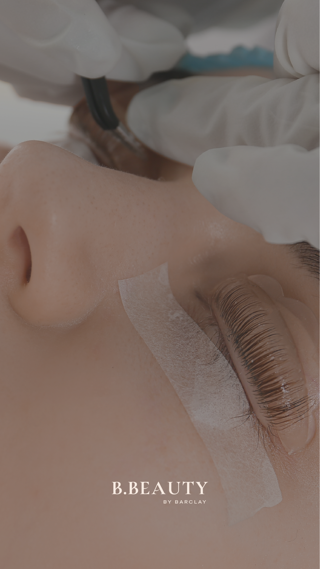
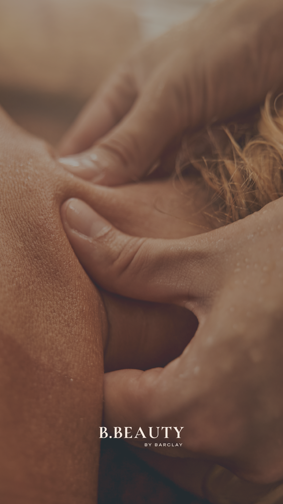
As the business matured, so did its audience. The updated brand reflects a shift toward timeless sophistication, grounded in luxury minimalism, softer contrast, and confident restraint.
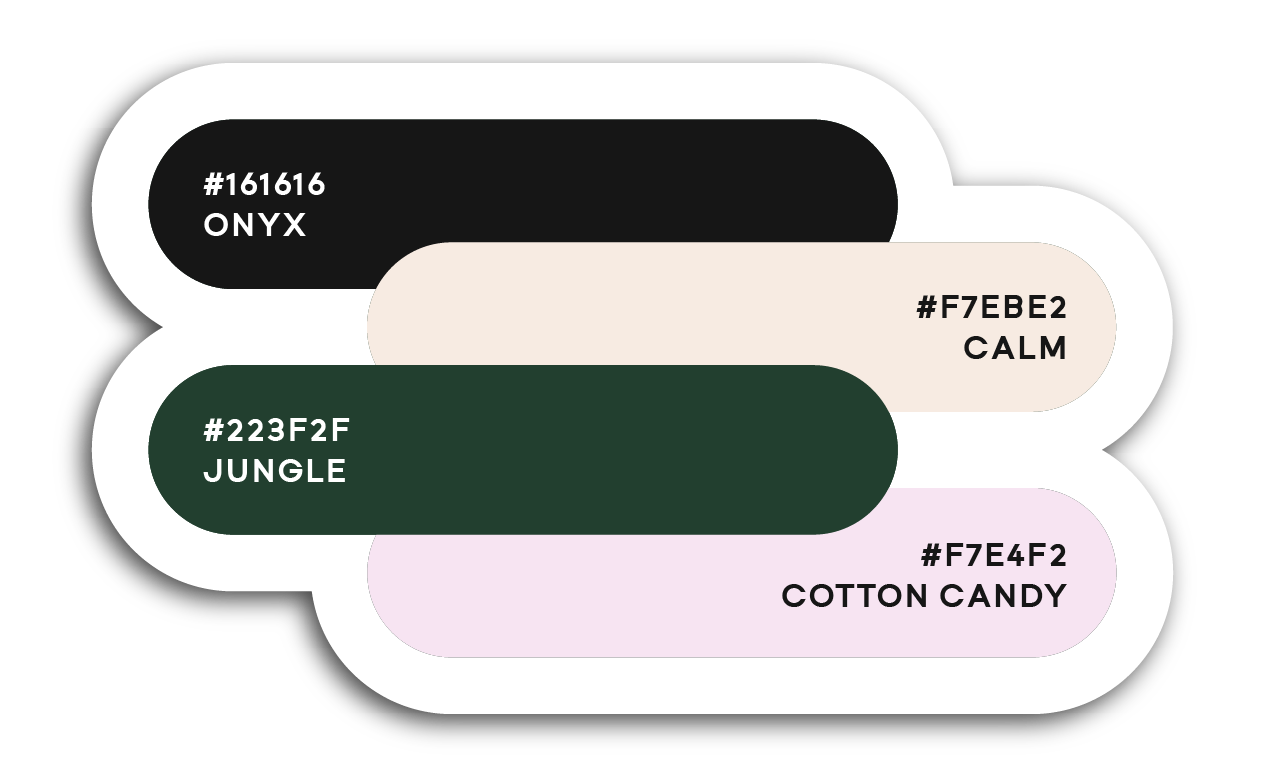
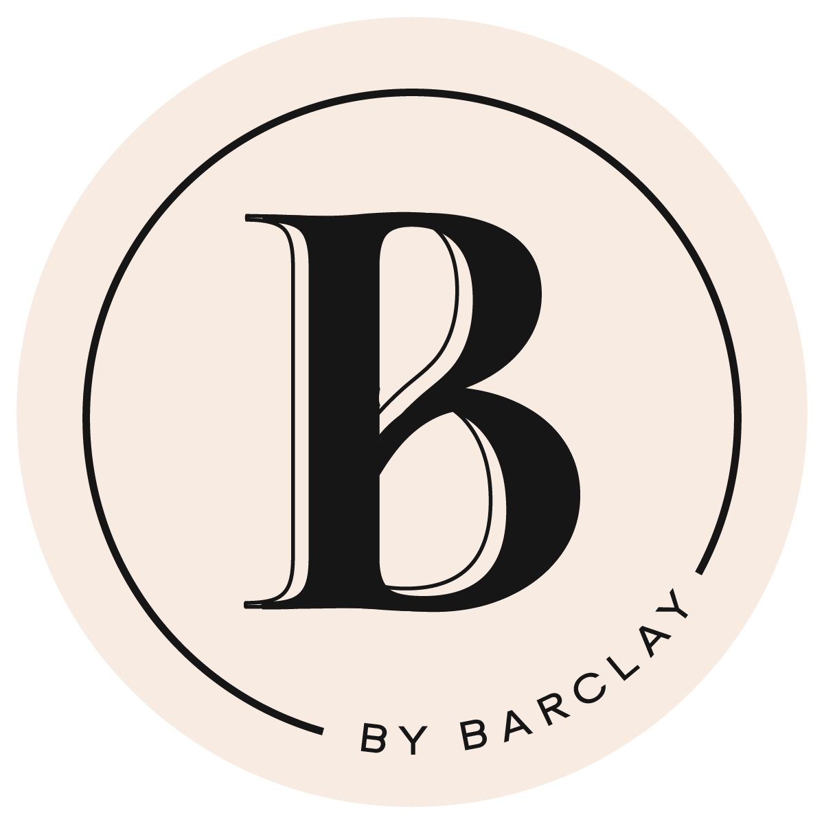
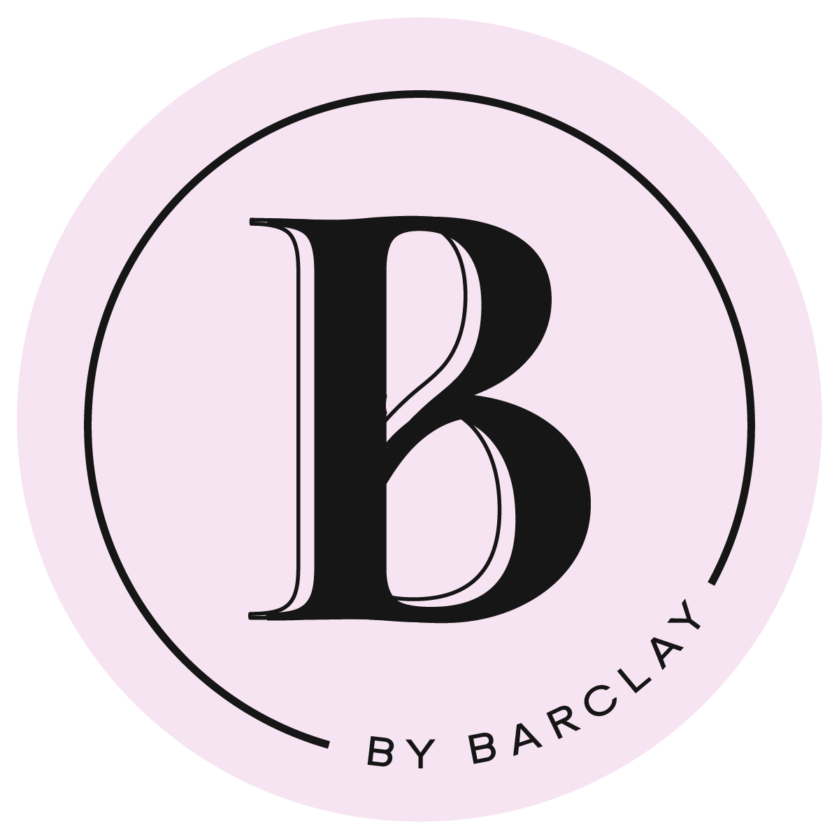
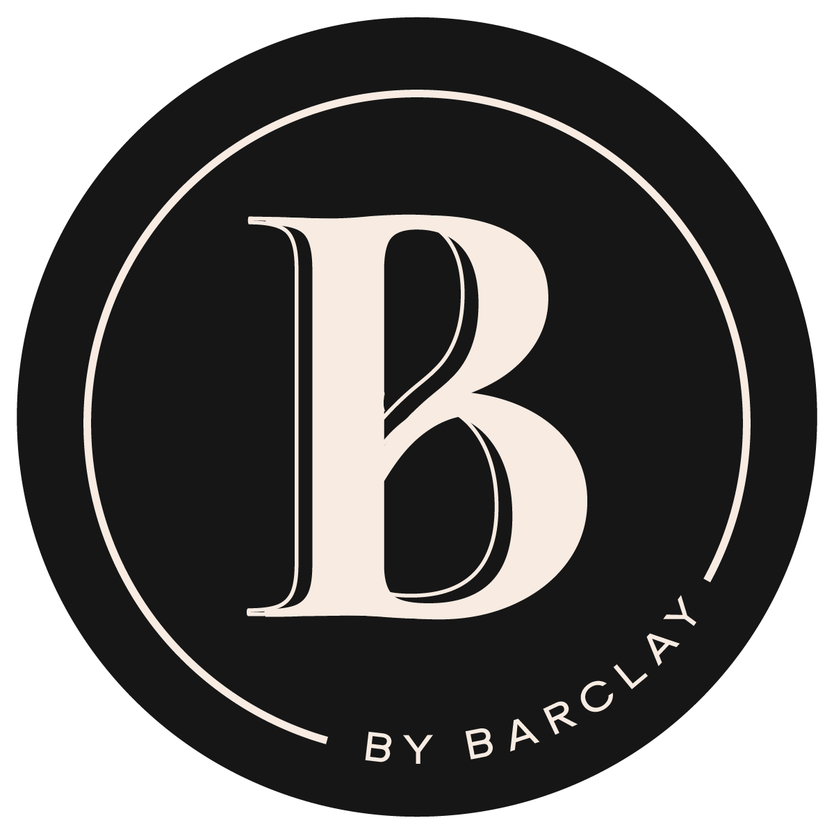
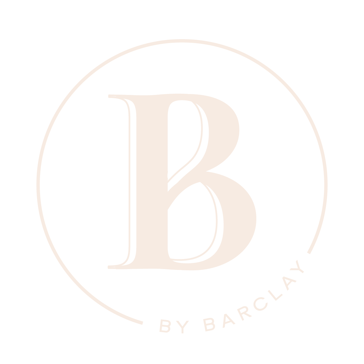
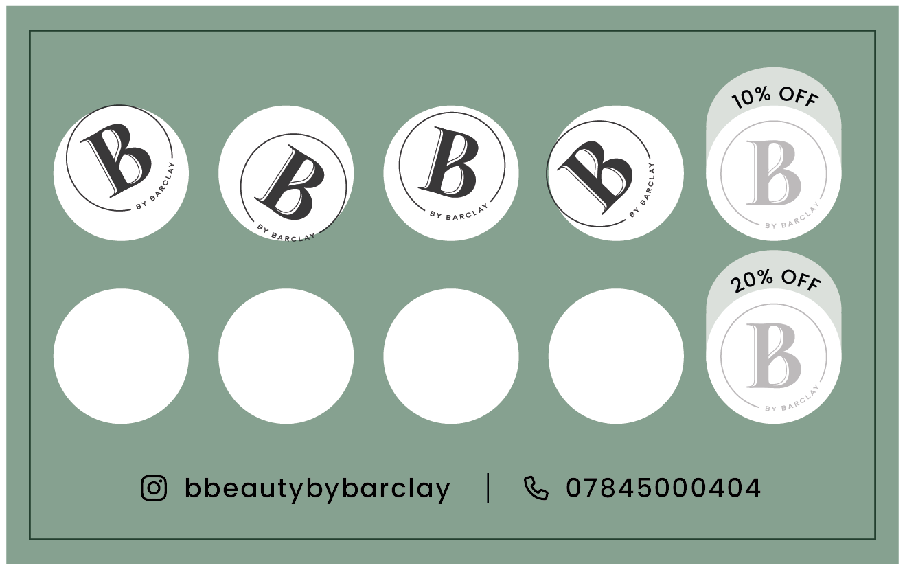
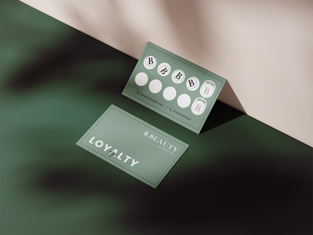
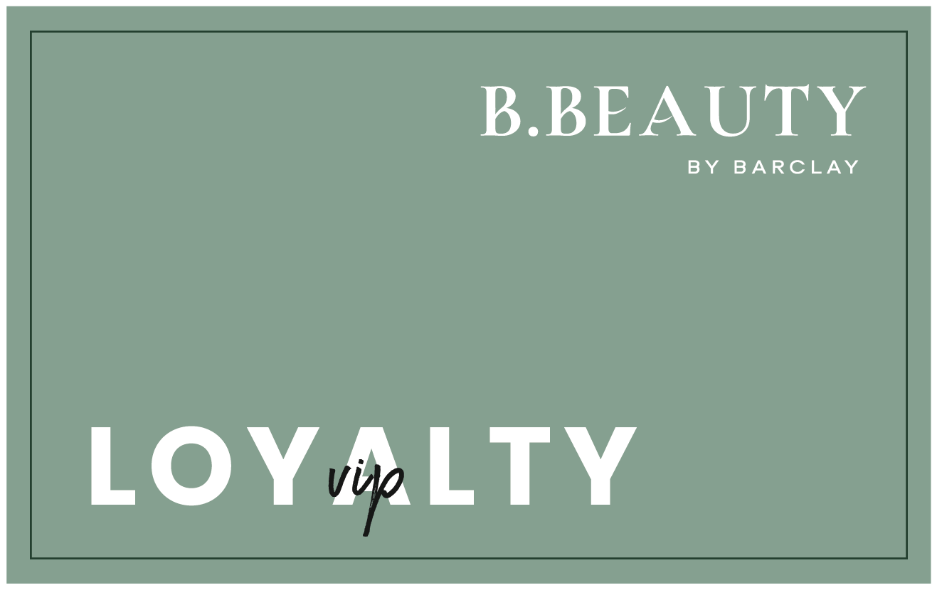
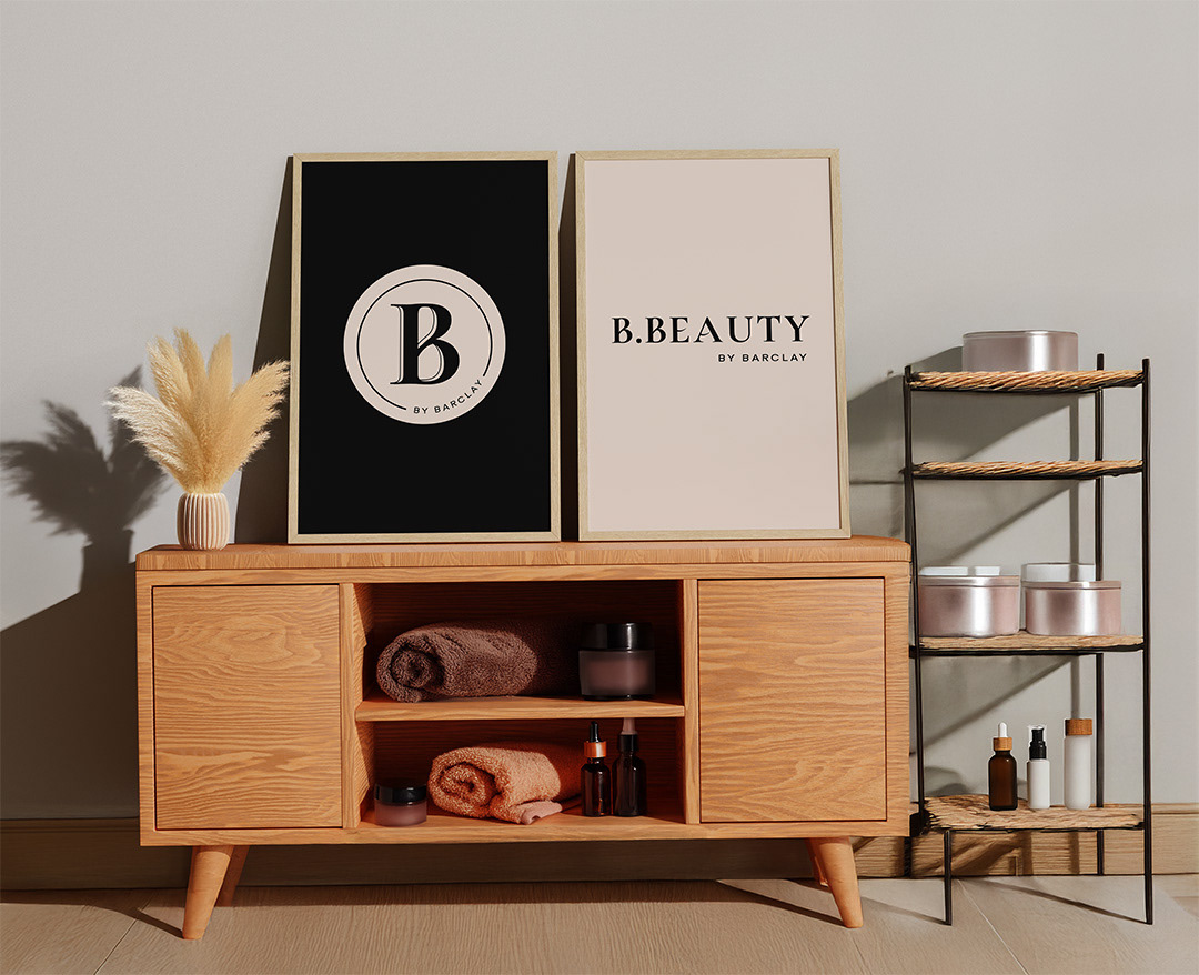
The refreshed palette (Onyx, Calm, Jungle, and Cotton Candy) brings warmth and composure, while the new typography introduces balance and clarity. The updated B by Barclay monogram translates seamlessly across digital and physical touchpoints, from social content to printed collateral.
(Phase One: At the bottom of the page)
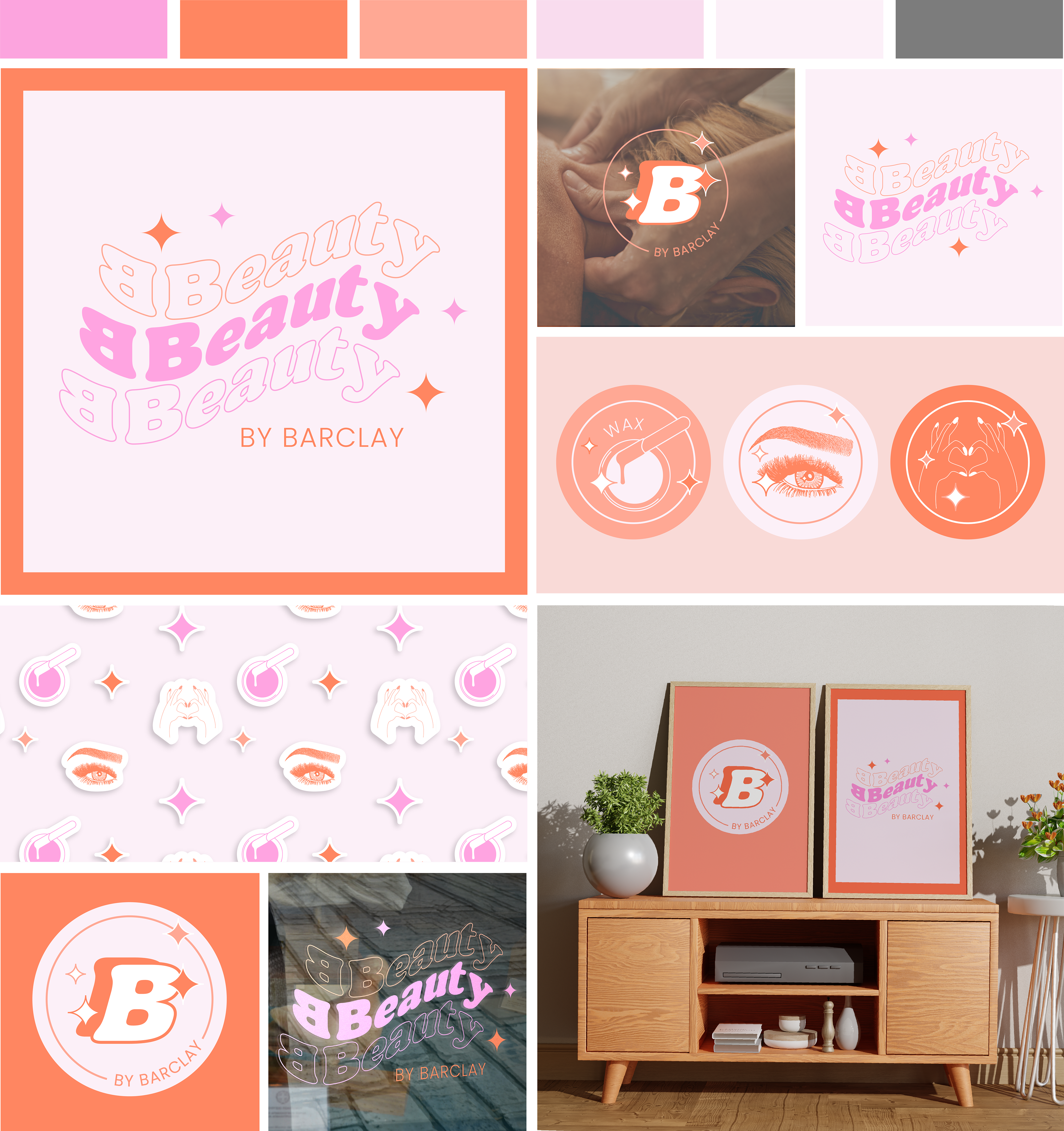
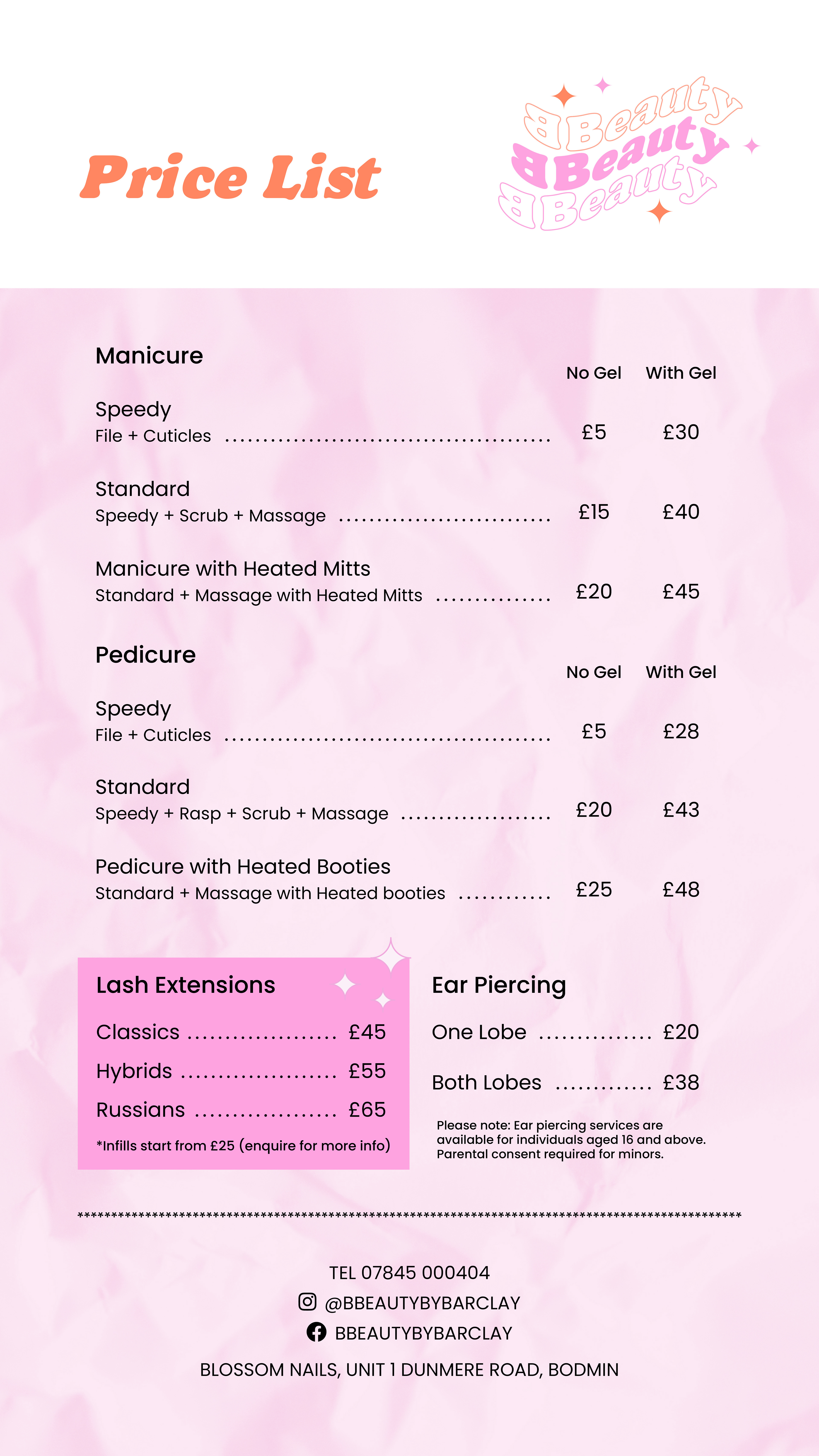
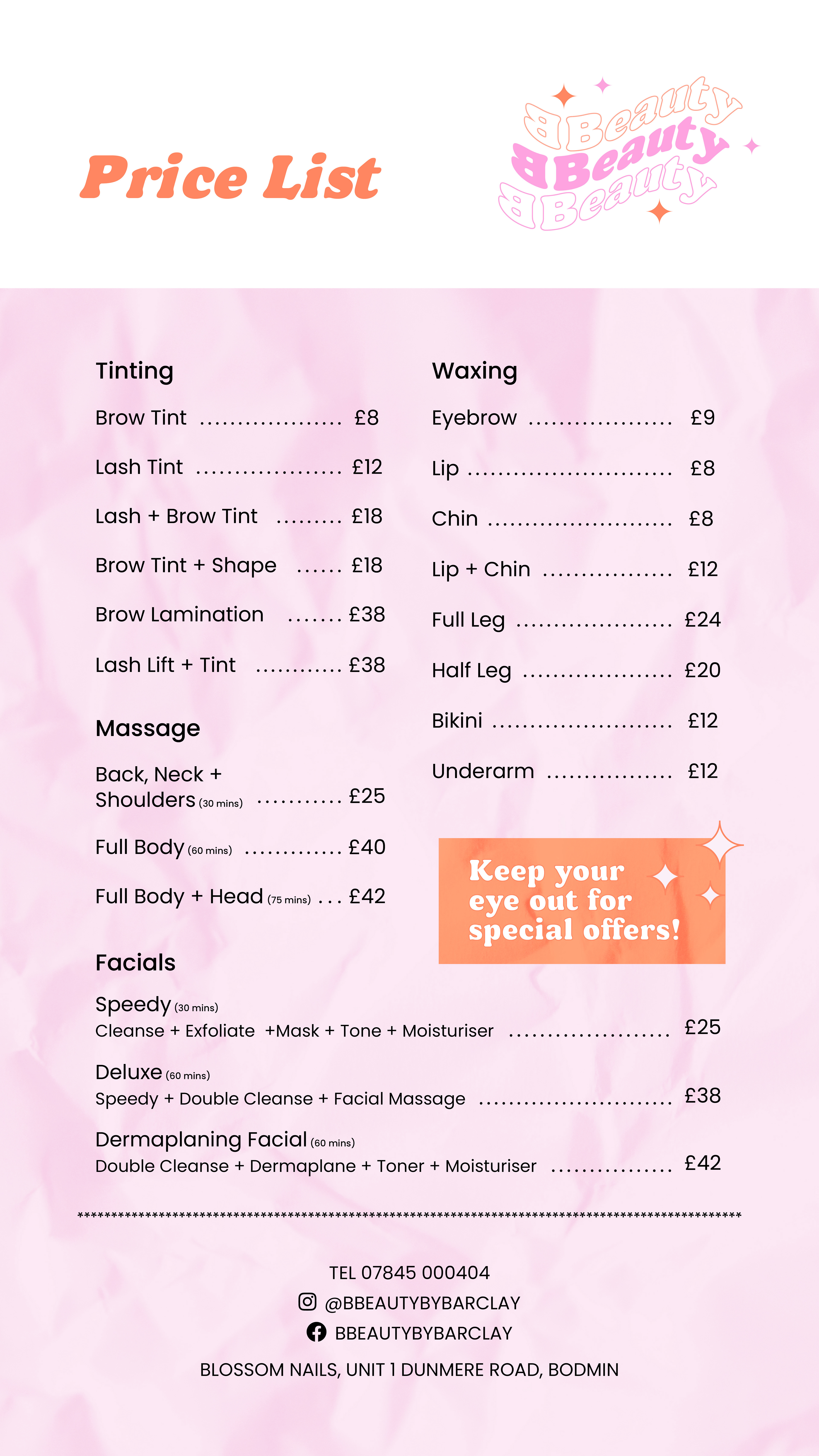
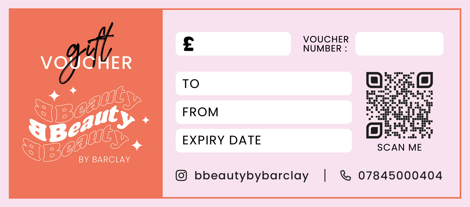
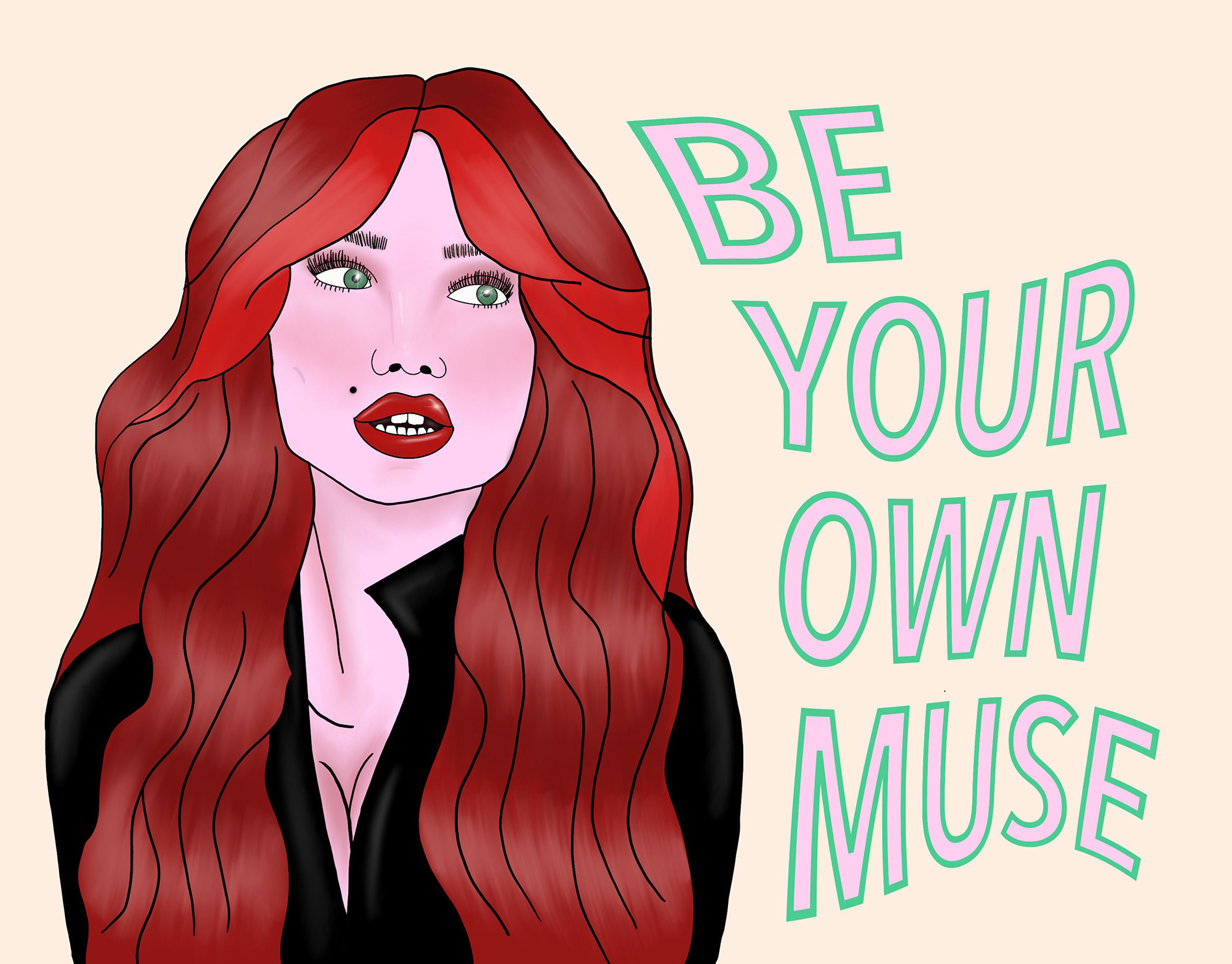
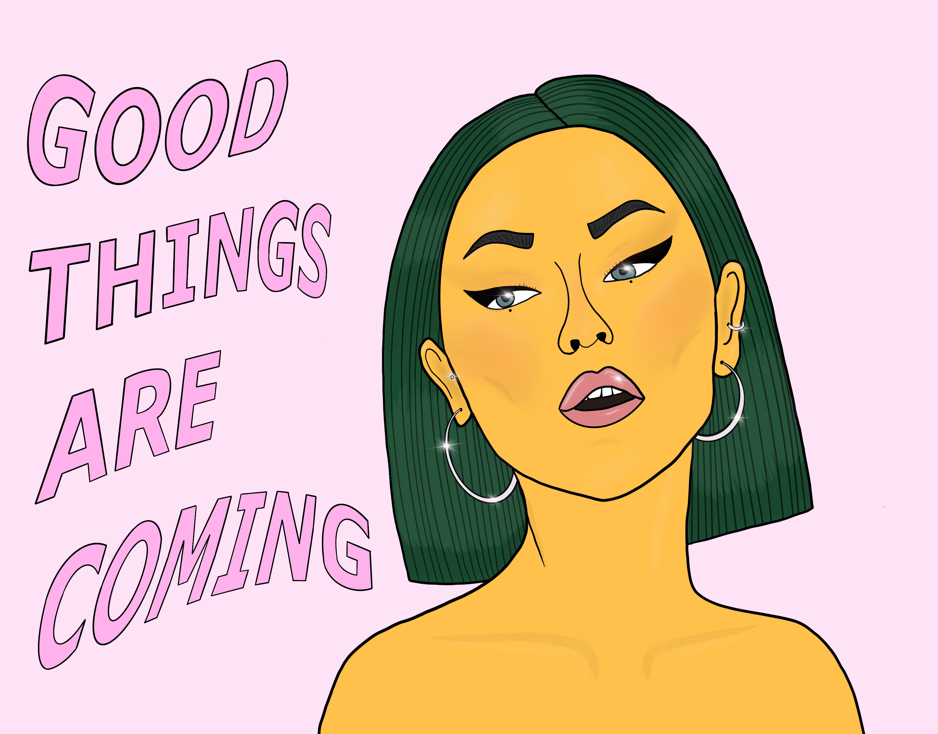
Phase One: Youthful Energy (2022)
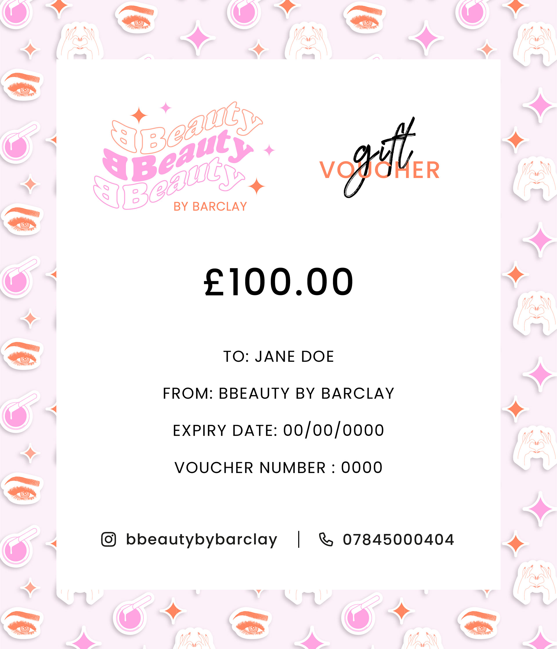
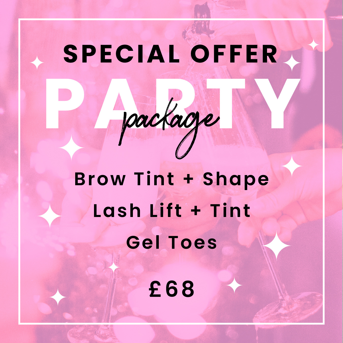
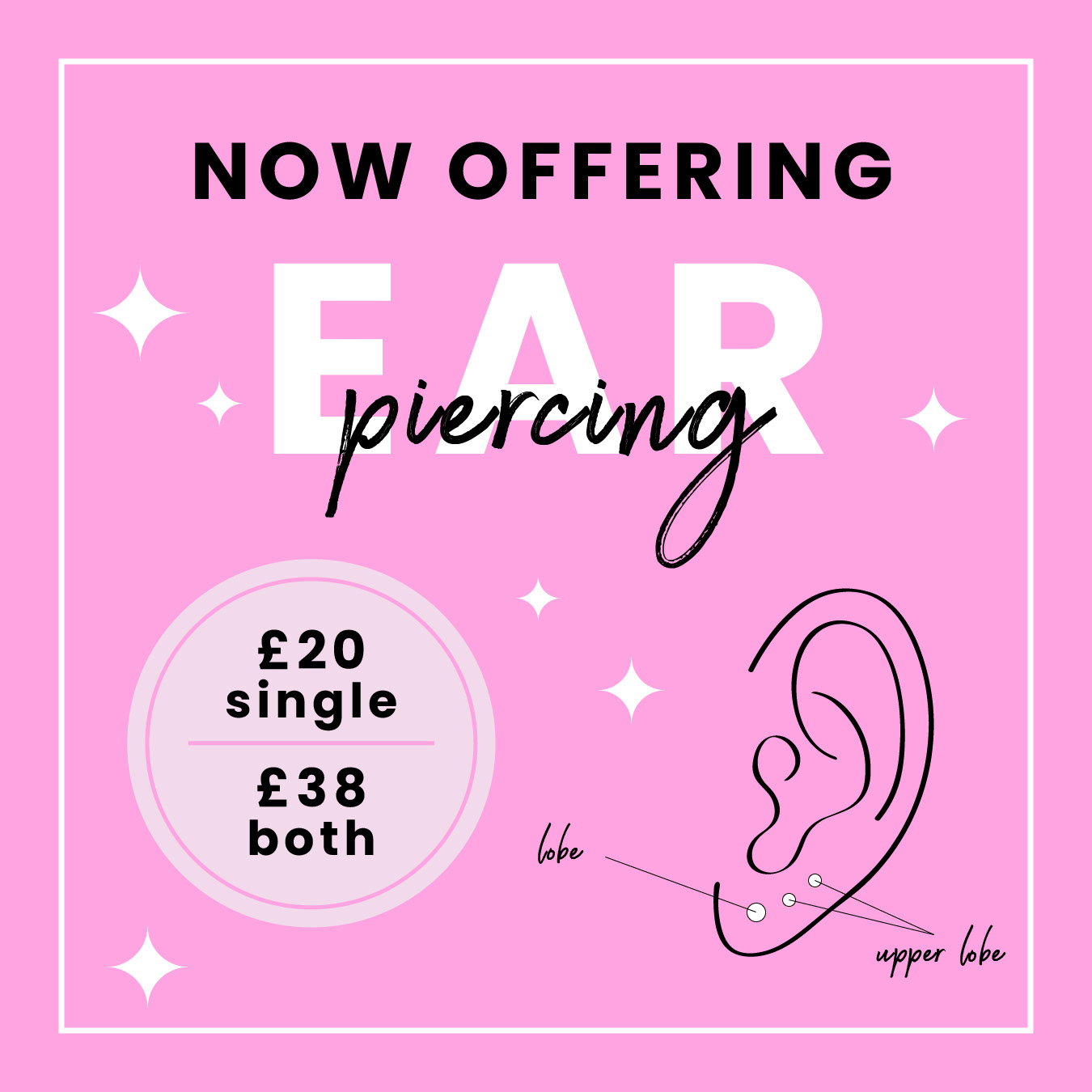
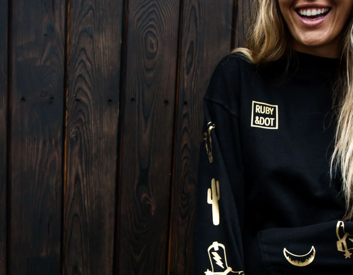
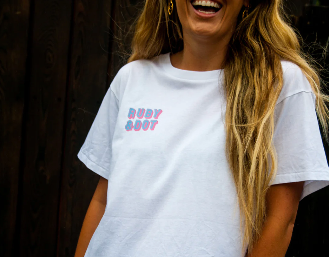
Originally, B.BEAUTY launched with a bold, playful aesthetic — saturated peach tones, 70s-inspired typography, and illustrated brand icons that captured the salon’s youthful, friendly spirit. The visual language reflected a vibrant new business entering the beauty industry with energy and personality. It was approachable, fun, and instantly recognisable, resonating with a younger audience discovering self-care and confidence.